Understanding stock charts should be the first step in understanding the art of technical analysis. Stock charts are the basic tool used in technical analysis to predict likely price movements of stocks based on past price movements. There are a number of different charts you can use to do this and today we will explain the most important charts and how these could be interpreted.
The charts simply display where the stock has been, in terms of price, over a time frame (which you can change to suit your needs). Each bar on the chart usually represents a day, however you can change the time frame of the bars with charting software. Two most commonly used charts are candlestick charts and OHLC charts.
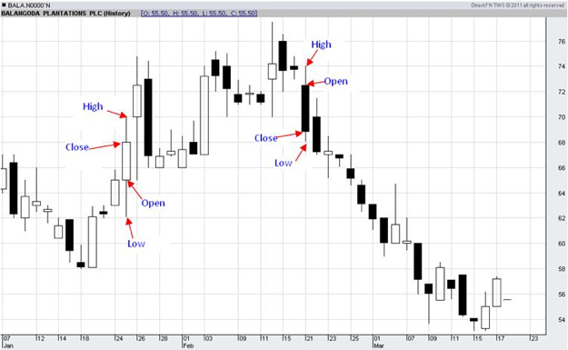
Candlestick Charts
This chart is made up of black and white candlesticks with "wicks" at both ends. A white candlestick would indicate that the opening price is lower than the closing price for that stock and a black candlestick would indicate that the closing price is lower than the opening price. In other words, if the price has dropped during a particular day the candlestick will be black and if the price has risen on a particular day the candlestick will be white. If the candle has wicks on either end of it the lower wick would indicate the lowest price for that day whereas the upper wick would indicate the highest price for the day.
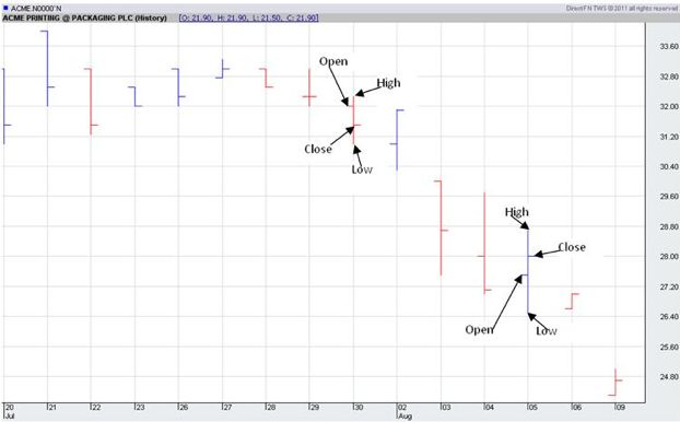
OHLC Charts
OHLC chart also shows the Opening, High, Low and Closing price of a particular stock for a particular day. A typical OHLC chart would look like follows:
This chart again shows data in blue and red lines. If the closing price on a particular day is lower than the opening price, the line will be shown in red and if the closing price is higher than the opening price the line will be in black or blue. The short line sticking out to your left from the main line is the opening price and the short line to the right is the closing price. The highest point is the day' highest whereas the lowest point is the day's lowest. The longer the line the higher the price movement is for a particular day and vice versa.
You will find a lot of these charts as we move on and it is important that you are able to read and interpret the charts if you are to understand the forthcoming techniques!